


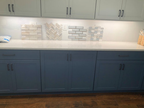
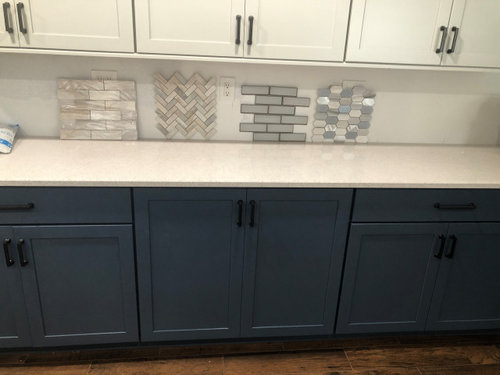
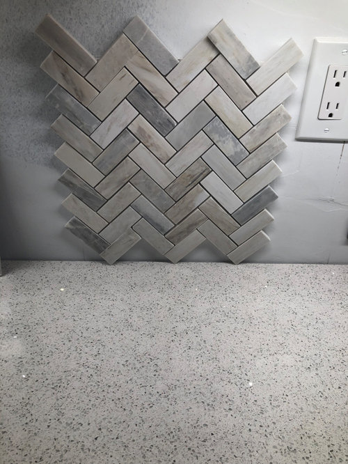
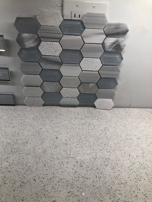
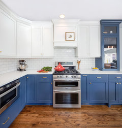
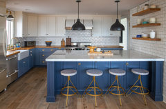
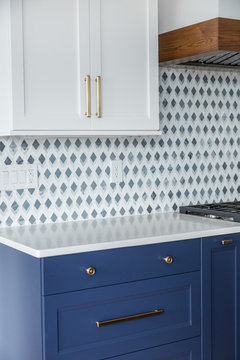
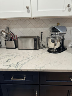
I need help choosing a backsplash
Ashley Brant
last month
last modified: 29 days ago


Featured Answer
Sort by:Oldest
Comments (64)
Related Discussions
Need help choosing a backsplash
Comments (2)That's what I thought I was going to get for years - white cabs and blue pearl - can't wait to see your pics! Folks say repeatedly not to actually order backsplash until the actual cabs and counter are in your kitchen. Then bring home actual samples of the backsplash material you are considering and see how it looks in your kitchen with your lighting at diff times during the day. What you thought you might love, you might hate, and the other way around. Dh might agree his suggestion does look too busy for the entire backsplash, you might agree to use the glass tiles as an accent in some way instead. Even the marble, you would actually have to see, as some samples may introduce way more or less grey than the look you are going for. I was just at a tile store yesterday looking at carrara marble subway tiles since I think that's what I want, but there was such tremendous variation of the tiles reading "white" or "grey" or other variations, from just a few feet away, that I know I can't make any further decisions until I can see it in my new kitchen (whenever that will finally be!)...See MoreStill need help choosing backsplash tile
Comments (16)ktj, I finally got a sample of the cameo today. I didn't really like it in the store and I liked it even less at home. For some reason they put more of the color "gunk" on it than they do with the Britton. If it had a lot less of the added color, it might not be so bad. The thing I really can't figure out is why in the store display--hanging vertically--the Britton bone has a much warmer tone to it and looks like it would go perfectly. But when you pick up a sample and look at it horizontally--or at my home in natural light--it has a very stark white/gray look. It's better than the Cameo but I need something with a bit of warmth....See MoreNeed backsplash help/white cabinets/calacatta counters
Comments (18)Walker Zanger has great tiles. I'd select something with a handmade look, with texture. Maybe a crackle, or wavy appearance. Also something with a slight color variation so it's not totally monochromatic. This Walker Zanger tile comes in several colors: This is a glazed brick and comes in various colorways: Love these green tiles! These are Moroccan Zeliige tiles: Fishtail tiles in a dark color make a great statement: Hand Glazed terracotta in turquoise works beautifully in this white kitchen: You could also use a pencil liner for an accent: Staggered 4x4 tiles in a pretty blue: These are all from my ideabook "Backsplash tiles and patterns" if you'd like to see more....See MoreNEED urgent help choosing backsplash tile colors (pics included)
Comments (10)You can do herringbone as an accent btw. Like under the hood. Herbflavors reason is probably along the lines of : Your kitchen is not plain. You’ll have two tone cabinets. Wood flooring. Windows ... it’s a lot of visual hopping around. I do think herringbone is a risk but will probably still look great!! I’m Totaly obs with herringbone also. I’m thinking what I’d do if this was my kitchen. Do you like finger tiles? It’s basically the small tile you picked it. It’s very pretty also! Love that......See More
Ashley Brant
28 days agoAshley Brant
28 days agoherbflavor
28 days ago
dani_m08
28 days ago
deegw
28 days ago
enajasereht
28 days agolslav2012
28 days ago
Boxerpal
28 days agotyort1
26 days agoBetty Wilson
26 days ago PRO
PRODiana Bier Interiors, LLC
26 days ago
Betty_Jo Zeigler
26 days agopscapella
26 days ago
lazidazi
26 days agolast modified: 26 days agoDebra Bradley
26 days agoenajasereht
26 days ago
arvilla_trag
26 days agoMari
26 days agolast modified: 25 days agodutchdebbie
26 days agojeannie_sang
26 days ago
hildegard09
26 days agoaniluap2
26 days agohollywaterfall
26 days agoshearthe
26 days agoloftissm
26 days agoblueskysunnyday
26 days ago
Sue Johnson
26 days agolast modified: 25 days agoSherry B
25 days ago
Elizabeth Ann
25 days agoMari
25 days agoLaura Magee
25 days ago21kim12
25 days agoslkusz
25 days agolast modified: 25 days ago
Jenny
25 days agocraftlr
24 days agorockdog1
24 days agoshenanno
24 days agoTara
23 days ago
Jen Pfifferling
23 days agoJen Pfifferling
23 days agolazidazi
23 days ago
KW PNW Z8
23 days agocabreu
13 days agocabreu
13 days ago
kariyava
12 days ago


Related Stories
DECLUTTERINGDownsizing Help: Choosing What Furniture to Leave Behind
What to take, what to buy, how to make your favorite furniture fit ... get some answers from a homeowner who scaled way down
Full Story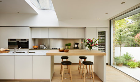
MATERIALSKitchen Ideas: How to Choose the Perfect Backsplash
Backsplashes not only protect your walls, they also add color, pattern and texture. Find out which material is right for you
Full Story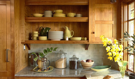
KITCHEN BACKSPLASHESHow to Choose a Backsplash for Your Granite Counters
If you’ve fallen for a gorgeous slab, pair it with a backsplash material that will show it at its best
Full Story
ENTRYWAYSHelp! What Color Should I Paint My Front Door?
We come to the rescue of three Houzzers, offering color palette options for the front door, trim and siding
Full Story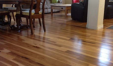
MATERIALSWhat to Ask Before Choosing a Hardwood Floor
We give you the details on cost, installation, wood varieties and more to help you pick the right hardwood flooring
Full Story
REMODELING GUIDESHouse Planning: How to Choose Tile
Glass, Ceramic, Porcelain...? Three Basic Questions Will Help You Make the Right Pick
Full Story
EXTERIORSHelp! What Color Should I Paint My House Exterior?
Real homeowners get real help in choosing paint palettes. Bonus: 3 tips for everyone on picking exterior colors
Full Story
KITCHEN DESIGNChoosing a Backsplash: What's Your Personality Type?
10 Tile Styles That Say a Little Something About You
Full Story
BATHROOM DESIGNHow to Choose the Right Bathroom Sink
Learn the differences among eight styles of bathroom sinks, and find the perfect one for your space
Full Story

gustaviatex